I specialize in digital media of all kinds, but it all started with my love for graphic design.
This was for an assignment that I was given in my first year of a graphic design course. I was instructed to create a layout for an eBook, the cover was created in illustrator, which was my focus program, and the layout was created in InDesign. the project was completed over the course of three days. this project holds a special place in my heart as it was the first assignment that made me feel as though I could truly be a graphic designer.
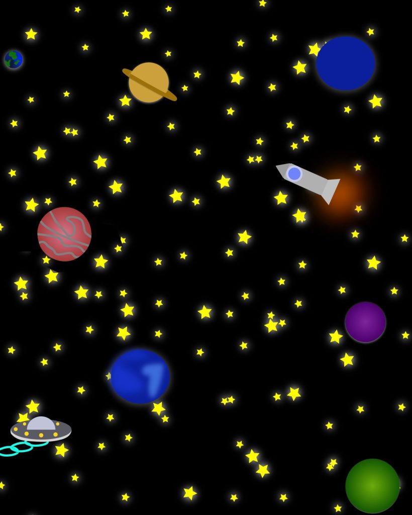
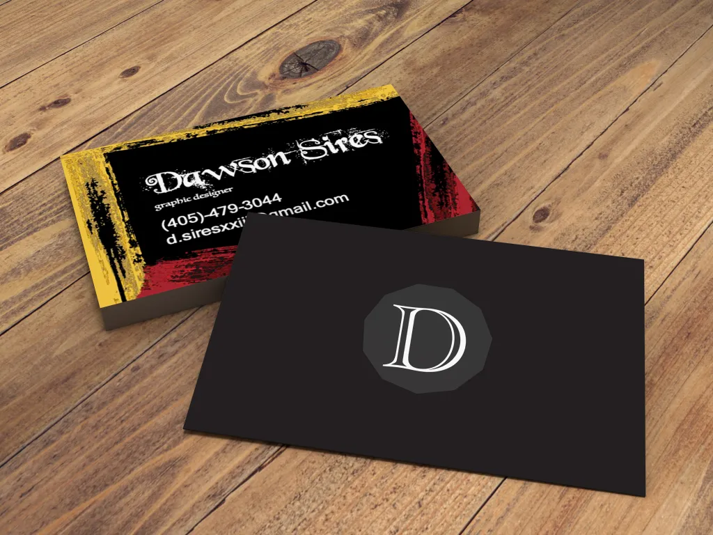
this is my business card. everyone has a business card it is often the first impression you leave on potential clients; I wanted mine to portray a sense of creativity. although I am professional in my interactions, I value creativity and quality of work over plain boring professionalism, and those aspects were challenging to convey in such a limited medium.These simplistic icons are from a challenge that I competed in to take home first prize. each vector illustration was made in five minutes and judged by quality, relevance to prompt, and time completed. I still often do five-minute design challenges to keep my basic graphic design skills sharp. I have included them in this portfolio both for a bit of fun, and to demonstrate a wide variety of styles and soft skills.
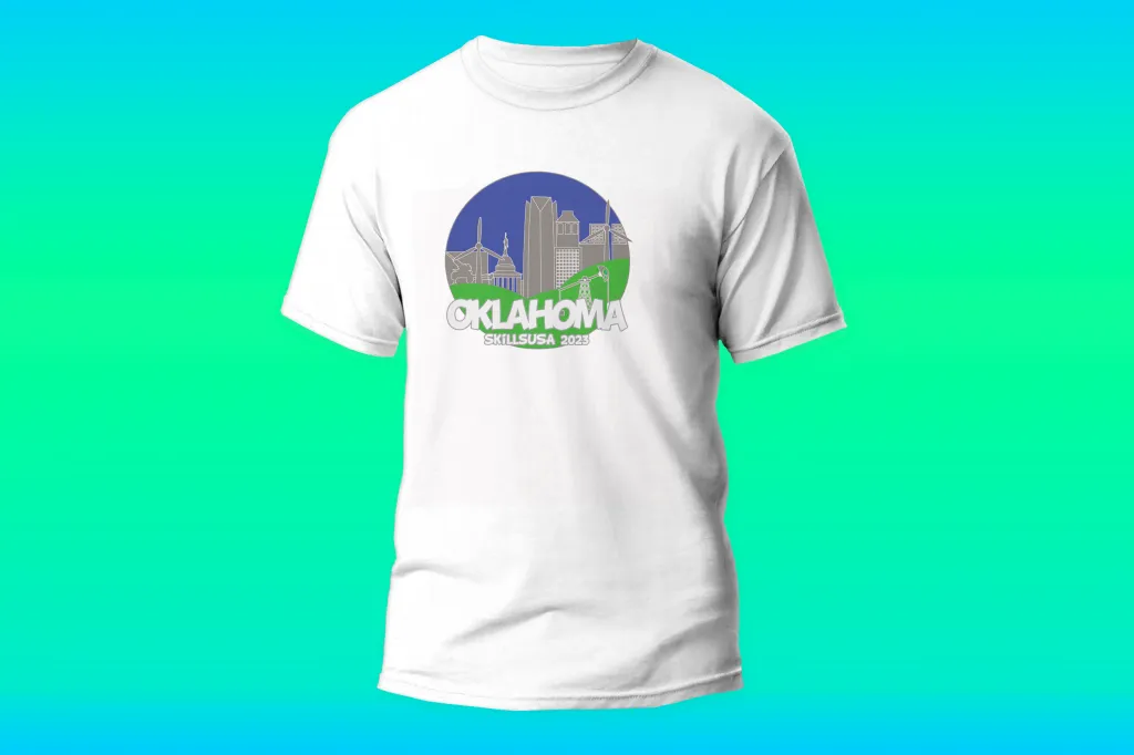
this project was created for a trade school convention called Skills USA. I was chosen, along with two other graphic design students, to represent out school in the t-shirt design event. this convention was broadcast to every trade school in the state of Oklahoma, meaning many talented designers were brought from all over the state. despite my then lack of experience i took home third place and a renewed sense of pride in my work.this was a design I made for a stamp to give to a local free library stand. it’s a small cabinet like structure with a small door and books inside. the community is encouraged to take books as they please and leave them as they please as well. I really enjoyed the concept of this centerpiece to the community and thus offered to design this stamp for free. the stamp hangs on a chain attached to the cabinet so that anyone leaving a book can leave it on the front page to signify where it came from.
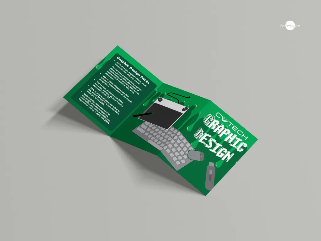
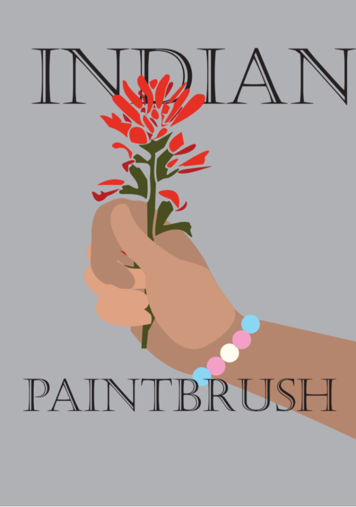
this project is a tri fold brochure made for the Canadian valley technology center’s graphic design program. I was tasked with catering to young students of local high schools who might someday want to pursue a career in graphic design for themselves. knowing this I was able to cater more to the fun aspects of graphic design, focusing more on the colors and simple shapes, than the strict rules I would normally follow.of course, I have to put this very website on this page, all assets and artwork are custom designed by myself.one of my proudest designs I created this cover for a short story I wrote covering the dangers of fascism in America. I wanted the cover to convey the simplistic, brutalist nature of the world within the pages, while showing the beauty that can be found even in the darkest moments. the flower represents that beauty, being grasped firmly by those who need to see that beauty in order to survive.
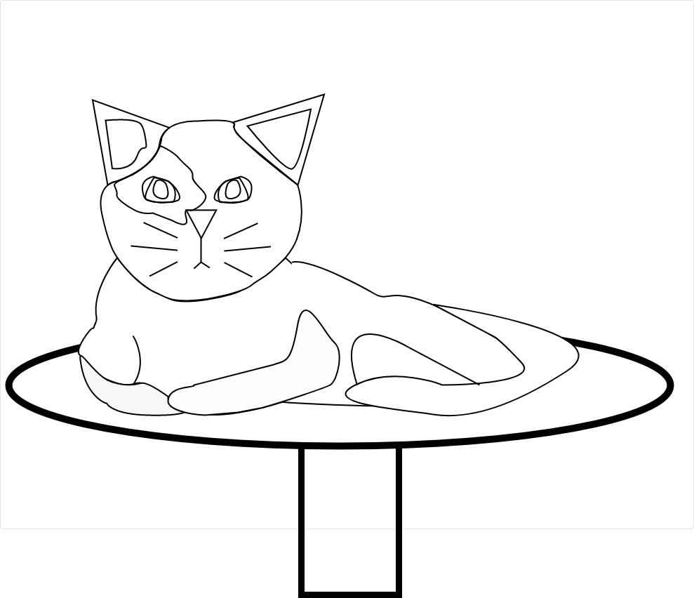
this was my contribution to a group project that I worked on with several others to create a cat themed coloring book. I was given a significant amount of creative freedom in this project and i enjoyed challenging myself with a new form of design I had never tried before.

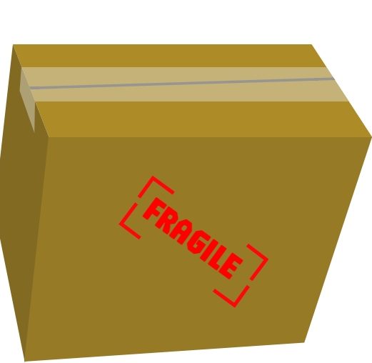

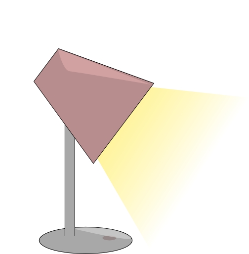 These simplistic icons are from a challenge that I competed in to take home first prize. each vector illustration was made in five minutes and judged by quality, relevance to prompt, and time completed. I still often do five-minute design challenges to keep my basic graphic design skills sharp. I have included them in this portfolio both for a bit of fun, and to demonstrate a wide variety of styles and soft skills.